
Course Popup - h2
The Course Popup component has 3 background colour options – White, Grey, and Primary brand colour.
CTA Panel - h2
The CTA Panel component has 3 background colour options – White, Grey, and Primary brand colour. Up to 6 CTA Buttons can be added.
Custom HTML - h2

Image Slider - h2
Slides consist of a background Image, Text Panel, and Button. Slides have 2 text panel colour options – White and Primary brand colour. The Panel can be Left or Right aligned, and the Panel Opacity Level can be adjusted to aid text readability.
Key Selling Points - h2
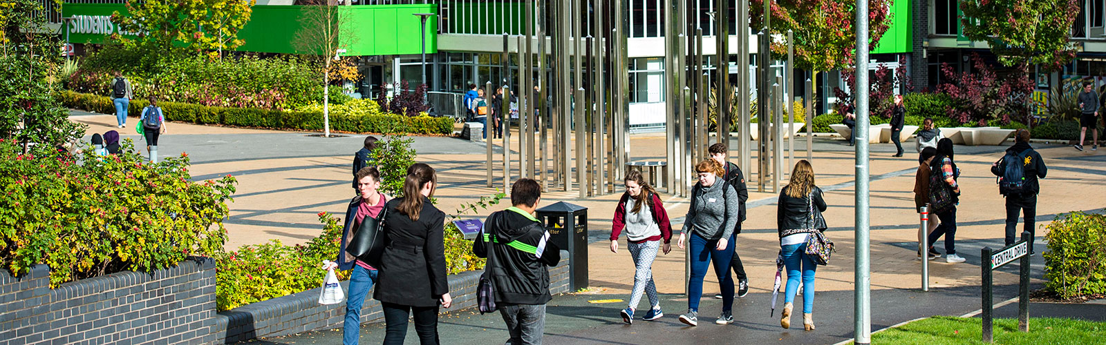
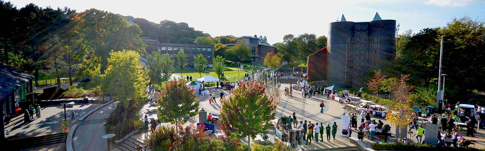
The Key Selling Points component has 3 background colour options – White, Grey, and Primary brand colour. There are two component Types to choose from – Font Awesome Icons and Image Icons. Custom PNG or SVG icons can be added via the Image Icons option. 3 or 4 KSP Items can be add in a row.
KSP 1 text – Lorem ipsum dolor sit amet, consectetur adipiscing elit.
KSP 1 text – Lorem ipsum dolor sit amet, consectetur adipiscing elit.
KSP 1 text – Lorem ipsum dolor sit amet, consectetur adipiscing elit.
Marketo Form - One Column - h2
There are 3 layout options for Marketo Form – One Column, Two Column, and Pop-up. The form can be added as a Single form or Stepped form. Stepped form requires grouping of related elements as field sets in Marketo.
All fields marked with * are required.
Media + Text - One Column Image
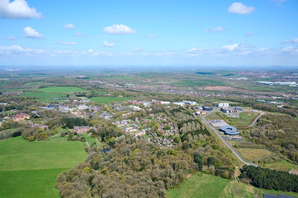
There are 2 types for Media + Text – Image and Video. There are 2 Layout options – One column and Two columns – and 3 Background Colour options – White, Grey, and Primary brand colour.
Media + Text - Two Column Video
Lorem ipsum dolor sit amet, consectetur adipiscing elit. Suspendisse vitae neque tristique, ultrices turpis a, efficitur quam. Aenean felis nulla, maximus elementum molestie sit amet, sollicitudin nec ex. Duis varius neque id aliquam dignissim. Nullam eu neque sed velit dignissim gravida. Nunc arcu lacus, ultrices ut porttitor ac, mattis in magna.

Spotlights - h2
The Spotlights component has 3 background colours options – White, Grey, and Primary brand colour. 2 spotlight Types are available – Image or Text. 2, 3 or 4 spotlights can be added per row.

Spotlight One - h3
Spotlight One text – Lorem ipsum dolor sit amet, consectetur adipiscing elit. Donec sapien risus, elementum at fermentum sed, fermentum eu neque.

Spotlight Two - h3
Spotlight Two text – Lorem ipsum dolor sit amet, consectetur adipiscing elit. Donec sapien risus, elementum at fermentum sed, fermentum eu neque.

Spotlight Three - h3
Spotlight Three text – Lorem ipsum dolor sit amet, consectetur adipiscing elit. Donec sapien risus, elementum at fermentum sed, fermentum eu neque.
Spotlights - h2
The Spotlights component has 3 background colours options – White, Grey, and Primary brand colour. 2 spotlight Types are available – Image or Text. 2, 3 or 4 spotlights can be added per row.
Spotlight One - h3
Spotlight One text – Lorem ipsum dolor sit amet, consectetur adipiscing elit. Donec sapien risus, elementum at fermentum sed, fermentum eu neque.
Spotlight Two - h3
Spotlight Two text – Lorem ipsum dolor sit amet, consectetur adipiscing elit. Donec sapien risus, elementum at fermentum sed, fermentum eu neque.
Spotlight Three - h3
Spotlight Three text – Lorem ipsum dolor sit amet, consectetur adipiscing elit. Donec sapien risus, elementum at fermentum sed, fermentum eu neque.